
In this unique season we have been re-evaluating everything, but one thing remains — what is precious to us is worth protecting. When it comes to selecting Senior Living color palettes, the hues you choose can create connection and association to fond memories or cherished things for your residents — reassuring them with the comfort they bring.
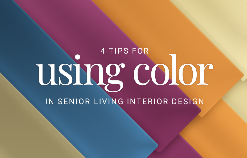
Here are this year’s top colors and a few tips to help you use color in Senior Living interior design:
2022 Colors for Senior Living
This year’s popular colors provide a timeless appeal, including pulls from evergreen nature and precious gemstones. Create a unique environment for your residents that pays homage to what they value, as well as small but intriguing luxuries. WGSN, a trend forecasting company, announced the 2022 color of the year: Orchid Flower. The key colors for 2022 show a balance of warm and cool tones. This year’s colors share the spotlight and reinforce the need for balance in design.

Sleek materials, moody jewel elements, a refined color palette and clean-lined furnishings marry together to cultivate an updated transitional aesthetic.
We’re seeing bold colors used to spice up a multipurpose room or punchy draperies in a dining room. Unexpected elements mixed into the homelike foundation can create a sense of light and excitement in the space.
With the baby boomer generation just beginning to reach their golden years, the seniors in your care today are much different from those before them. Your residents are inquisitive individuals who want to be treated as such. Help create an environment for life’s next stage that encourages originality and character by incorporating vibrant accents around stable, warm foundations. These will equate to a balance of safety in what is known and excitement in what is to come.
4 Tips for Selecting Senior Living Colors
1. Scale the intensity
From creating peaceful retreats to designing invigorating spaces, the key to achieving the desired feel is choosing the right color intensity. While softer blues and greens are used to create a calm, tranquil environment, blue can also be an intense, exciting color – a loud turquoise or teal is much different from a soft cornflower blue. High-intensity colors will create more excitement, making them great for lobbies or activity spaces. Consider the feelings colors tend to leave us with and the ways intensity might change that:
- Red is associated with importance and love. It is known as the color of energy and can increase a person’s pulse and heart rate.
- Purple is associated with luxury and royalty. It makes a room, and the people in it, feel a sense of grandeur.
- Yellow brings happiness and warmth. It denotes a sunny disposition and draws attention.

An example of scaled intensity is shown above with a pop of sunny, attention grabbing yellow throw pillows balanced with a neutral wall color and simple blue artwork.
2. Consider the room’s function
When deciding whether a calm shade of pink is more appropriate than a loud red, consider the function of the room. Reds, oranges and yellows all encourage our appetites, which can help promote proper nutrition. Brighter shades of blue might be appropriate for an energizing rehabilitation gym, while softer yellows or greens would work well in a relaxing sunroom.

An example of earthy green tones is found here in a small household living-like dining area, supported by revealing, trendy cabinets.
Blues aren’t commonly found in Senior Living dining rooms because they can cast a strange hue onto food, making it look unappealing or bruised. Earthy greens, on the other hand, make dining rooms feel invigorating.
3. Aim for contrast
As the eyes age, color perception in elderly residents declines, and it becomes more difficult to distinguish between objects in a room. Help differentiate between major pieces of furniture, walls and wall railings, drapes and floors with clear color contrast. This approach is also helpful for different pieces of bedding.
Blue and green tones are particularly difficult for aging eyes to distinguish. Consider using warm reds and golds, which are much easier to see.
4. Adjust colors for Memory Care
Colors are especially important in Memory Care environments. For residents with dementia, dark colors may appear as a hole or missing space. Consider using darker shades purposefully when creating a walking path or an area that residents should avoid.
Color intensity is also an important factor in Memory Care. Refrain from intense colors, and keep in mind the vibration and saturation of the color you’re selecting.
Flooring or patterns with high contrast can play tricks on the eyes, appear as though they’re moving, or may make some residents feel dizzy. Residents with dementia may even believe something is coming out of the floor and be afraid to walk there. Solid colors in softer shades can be the best paint colors for dementia and Memory Care environments.
Find more tips for designing for Memory Care environments.

The use of color, texture and material combined here reflects of the character of the surrounding community, perfect for Assisted Living and Independent Living care types.
The Bottom Line:Color Trends for Senior Living
Color matters! The colors you choose to incorporate in your Senior Living facility impact resident emotional well-being and safety. We can support your Senior Living design project with a complimentary selections service to coordinate fabrics and finishes with your wall colors.
Are you an interior designer? See how we can help with your Senior Living design.
For more Senior Living insights and support on your next design project, connect with our Senior Living experts today.